Sandy (2012)
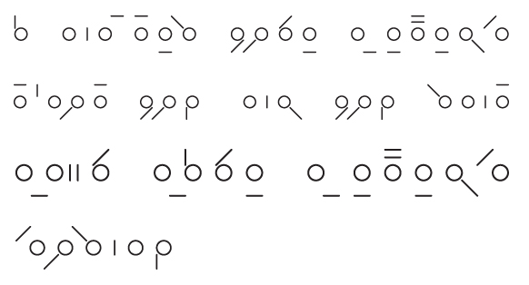
The typeface Sandy revolves around the idea of being able to reproduce each letter by hand with ease and speed when handwriting. The letterforms look to separate themselves from the arbitrary shapes that we know in the Latin alphabet and present their forms as a system of simple components with individually identifiable elements.
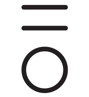
Taking its foundations from the later design cues observed in process of creating Amble, Sandy was a means by which I could explore the impact that very restrained letter components (a single circle and a single line) could have on the creation of letters that were as individual as they were part of a sequence or set.
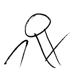
My desire was to create a typeface that was not only systematic in appearance and essence, but also one that, outside the computer, could be imbued with the personality of the individual writing down the letters.
The typeface also includes single characters for common collections of letterforms, such as double letters (ee, oo, ll, etc.), frequent words (the, of, to, for, etc.) and letterforms that often appear together (er, ed, th, st, etc.) in an exploration of spacial economy. In some cases I have also adapted this to also includes names such as Barry (seen in the second last image).


