Amble (2012)
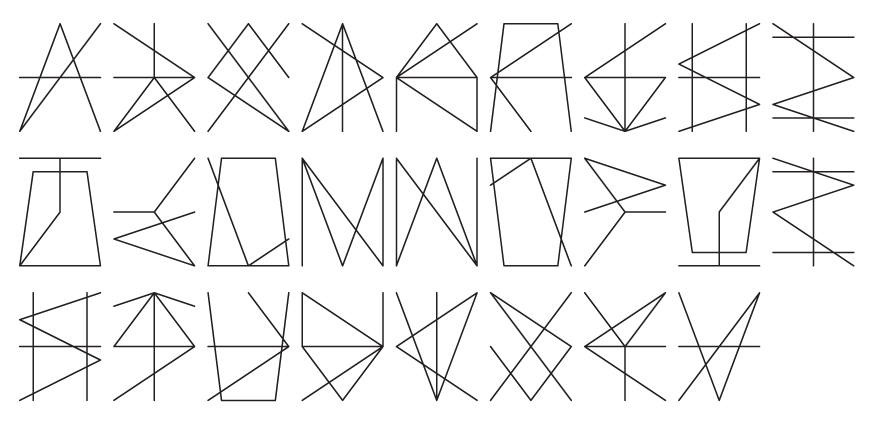
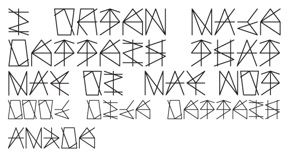
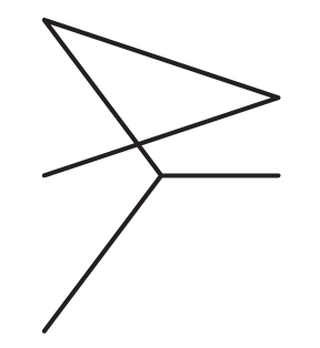
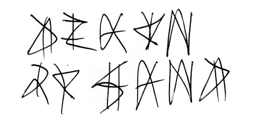
Amble is a typeface designed in a similar vein to Hector, but began life as the forms for Mosey. It investigates the effect of a high level of complexity in regard to its included components; however, these components are identifiable elements taken from the existing letterforms.
Essentially the typeface is a means to explore the idea of what happens when letterforms are made of nothing but familiar and recognisable elements, but these elements, added together, lead the letterforms to becoming separated from the familiarity and recognition usually found through these components.
