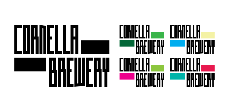
Cornella Brewery Branding and Core Labels (2020)
In late 2019/early 2020, Cornella Brewery approached me to create a new visual identity, branding and core can labels for their growing beer enterprise.
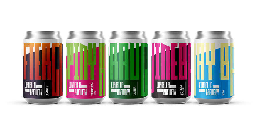
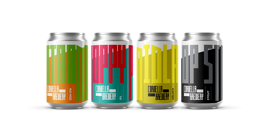
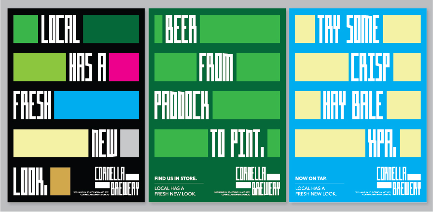
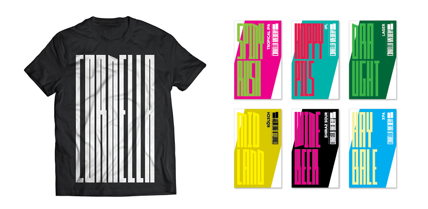
Exploring an adaptive visual style that could work with and incorporate each of the bold colour schemes, names and tailored messages drawn from their vast variety of beers in their growing core collection.
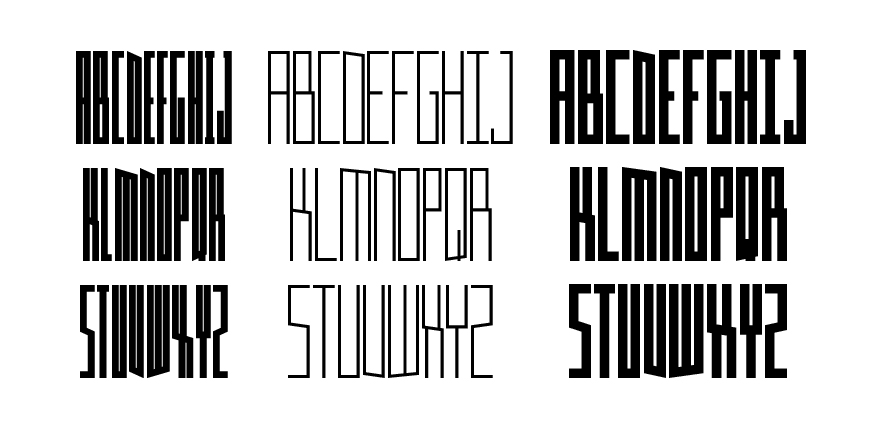
Utilising my variable typeface ‘Clu’ and bold blocks of colour, affectionately known as ‘paddocks’, I set about creating new variants of the font that would effectively respond to the height and width of the cans and titles, along with other products and merchandise.
The result is a bold, typographically focused design that is strikingly simple yet vibrant with a uniquely playful tone and includes cans that stand proudly on the shelf.