ProtoType Exhibition (2016)
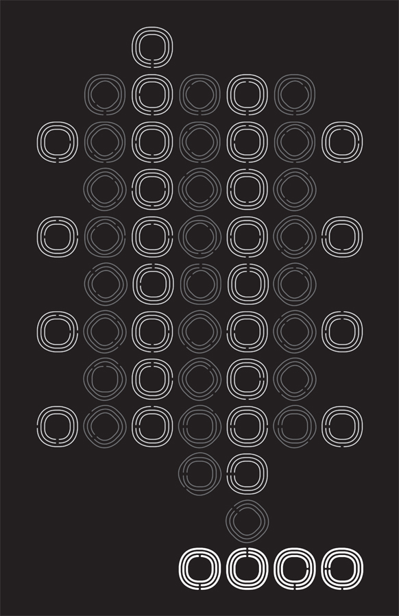
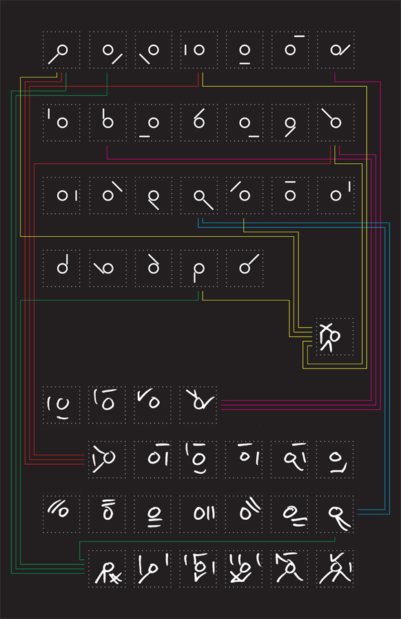
These three rejected poster designs were created for the exhibition ‘ProtoType’ held at TypeCon in 2016 that aimed to highlight “speculative typeface design” and “experimental and innovative type designs”.
Looking to provide a range of ideas I selected my typefaces Amble, Cody and Sandy, (having featured in my doctoral thesis on speculative type design) because they each presented a different way of pushing the typographic envelope.
Amble was chosen as a way of showing the potential of letterform shape economy, Cody for his code-like and systematic departure from the Latin letterforms and Sandy for her progressive approach to how letterforms and common letter and word compositions could be created. Check out each of their individual pages for more details.
Ultimately however, they were all unsuccessful and never got to see the light of day until now.


