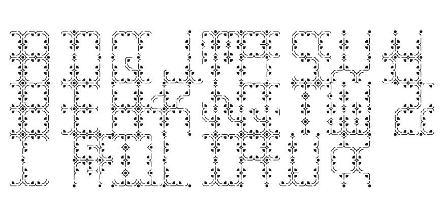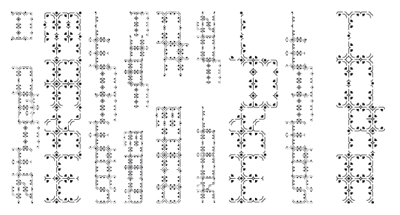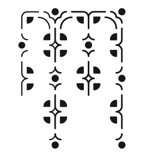
Cora (2016)
Cora explores excessive amounts of detail within letterforms through the use of grid 80 from my #100daysofspontaneous series. To create this typeface I started with the idea of reversing the composition of the letters (left hand elements on the right and vice versa) to initiate a perceptual challenge, after which I created the “correct” (recognized) versions for each letter before overlapping each over the other. The name Cora comes from her detailed and decorative forms.